A youthful and elegant site to enrich the flavor of socializing
Company
Afrah Tobacco
Scope
2 months
My Role
Product Designer
Tags
Website Design, Branding, Product positioning
01 Khaleej
New brand
Afrah Tobacco is a Shisha Tobacco Manufacturing Company based in the United Arab Emirates' Ras Al Khaimah. They have a number of well-known brands and products in the northern and southern African markets.
They were introducing a new brand called "Khaleej" which is a fruit-flavored tobacco, and wanted to create a website as part of their existing branding.
02 Case Summary
Product Vision
Khaleej aspired to be known as the world's leading supplier of specialized and innovative shisha molasses products that offer superior quality, service, and value to legal-age smokers.
They already had a powerful branding concept, as evidenced by the exceptionally good packaging and marketing materials. The website would work as the primary source of truth for customers.
Challenge
Designing a website that reinforce the concept of the brand as a social product and engage with an audience used to interact with highly constructed brands and content.
Outcomes
Thanks to the provided research and documentation, I was able to understand the challenges and the vision of Khaleej.
After a few revisions and tweaks, we arrived at a satisfactory solution that performed fairly well on the audience.
The modularity of the site, as well as the incorporation of the core principles of their product identity, were a key factor to success.
03 Research, discovery and analysis
Kickoff
A great beginning
I was provided with a lot of literature, research findings, brand identity, and an early design system. I completed this research with my own desk research. Took me a while to go through all the material.
The culture...
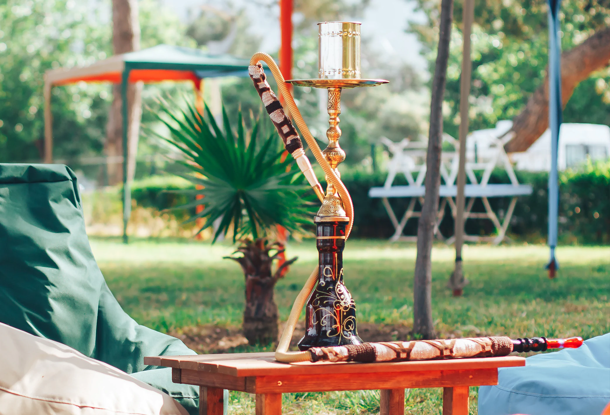
The motto of Khaleej was that "partaking and using shisha is a time to celebrate the good things in life. It's about being with the people that matter to you".
I was physically far away from the area where these products were mainly consumed, but I was not a stranger to the culture of the shisha as a social event. I lived my youth in the south of Spain close to North Africa. And traveled to countries like UAE.
...and the people
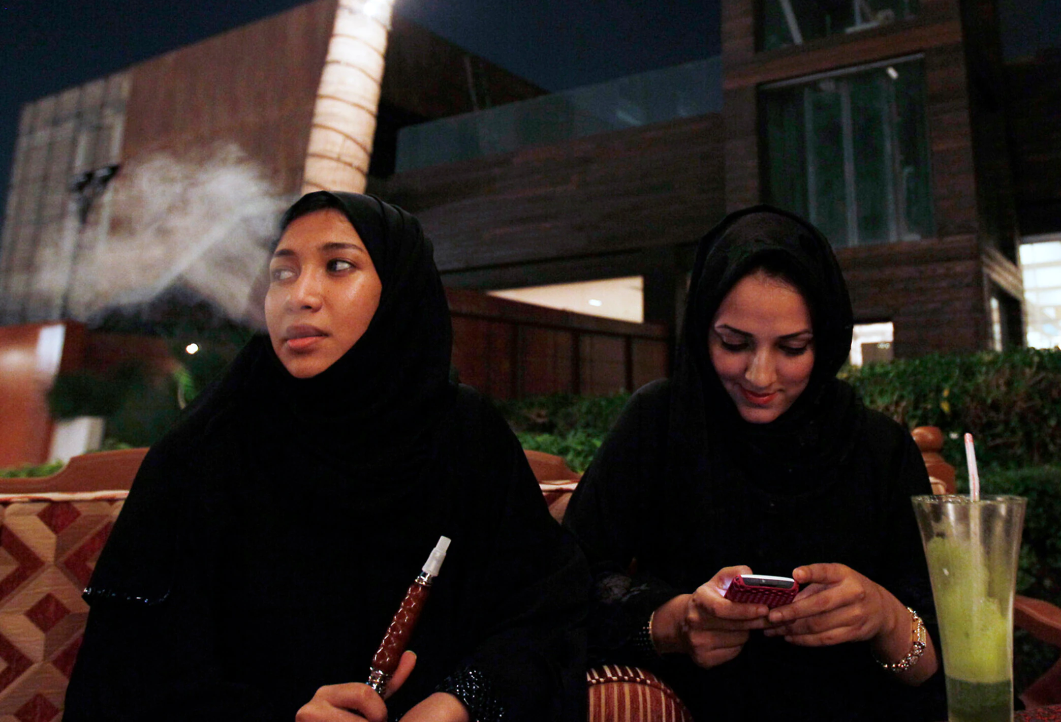
In that context, and using the research findings and the business requirements, we defined a target audience. Which greatly surprised me.
- Wide age range. As shisha is very popular, most people use it. Khaleej wanted to specifically focus on people who go out and socialize more often: 18 to 48
- More than 62% were women
- They have high education and a more global vision
- Most of them speak good English
- Exposure to products and digital content that varies from medium to high quality
- Interaction with highly constructed brands and content (i.e. Facebook, Youtube, Instagram as well as products like Oreo, Pepsi, Starbucks...etc)
Khaleej's identity
After analyzing, I started to mentally map a strategy. The branding already had a well-defined guidelines, so I took into account the fact that no matter the architecture, the final product would need to feel and look cohesive with this identity.
I would be functional with good usability, but at the same time:
- Arabic and International
- High quality
- Young and modern
- Affordable (mid-range, not premium)
- Elegant by combining black, dark grey, white, and gold
- Disruptive on occasions using the flavor colors as accent and the leaves as pattern
Khaleej's values
At this point, I was ready to start the architecture and main interactions and features. I took a look at the requirements as they wanted some concepts covered in the website. To reinforce their image, Khaleej promoted the following values:
-
1 Quality time
-
2 Socializing
-
3 Relationship strengthening
-
4 Fulfilling a need/ habit
-
5 Enriching social time
04 IA and usability
The structure
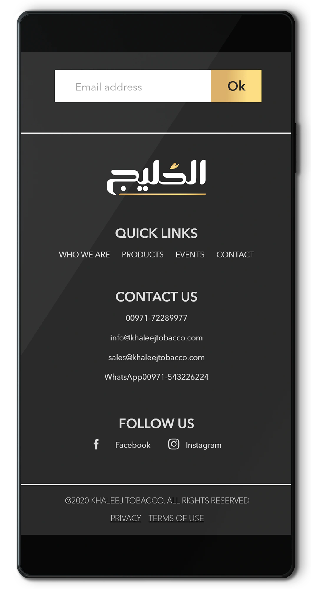
As per usual, I invested a lot of time trying to nail the information architecture so the user finds it easy to navigate.
A relatively simple website usually equals a relatively simple navigation. This one being focused on values, information sharing, branding did not have a very complex interaction or rabbit holes.
Linked
Basically, the pages would consist of a series of links to products and product details and back.
The forte of this website would be its simplicity and visuals.
No complex flows (like checkout), less chances for confusion.
Tested
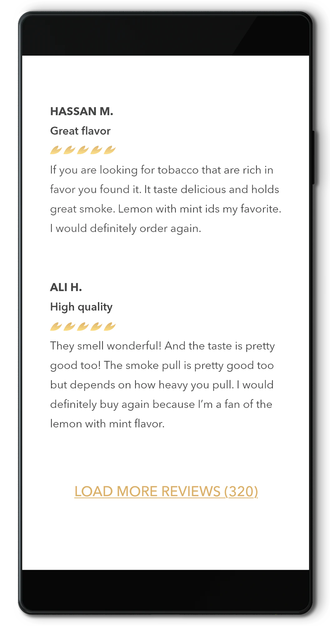
I tested the main interaction and found out that the most confusing flow was that some users expected to see a shop at some point.
The most asked question was why someone would buy the product in another place and come back here to leave a review.
Hands on
Regardless, the website was still on sketches, so we decided to test later when all the visuals were in place to check if they see these 2 concerns as primary flaws.
The review button would eventually stay as it was considered by stakeholders as essential in the creation of a community and a place of reference.
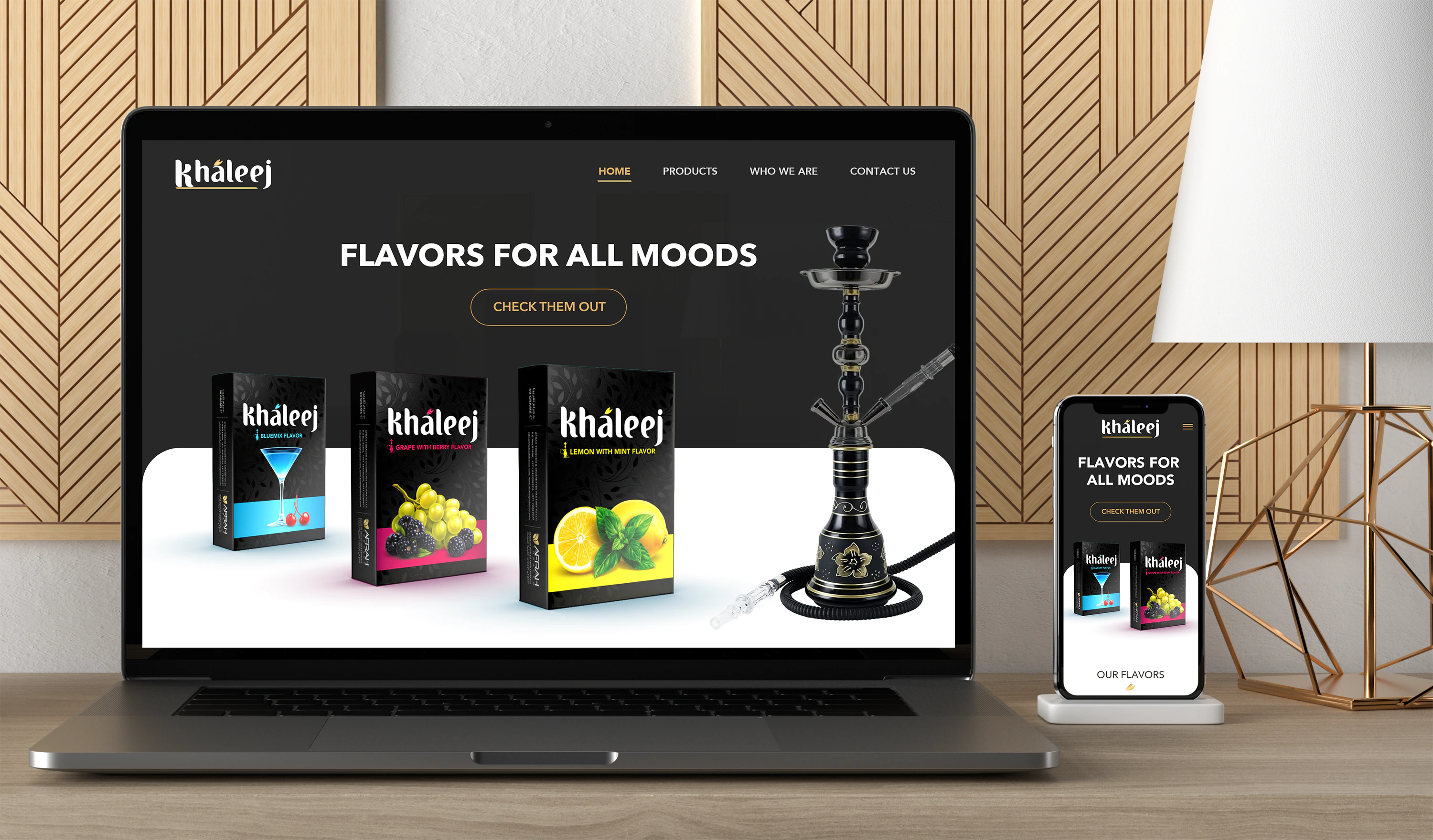
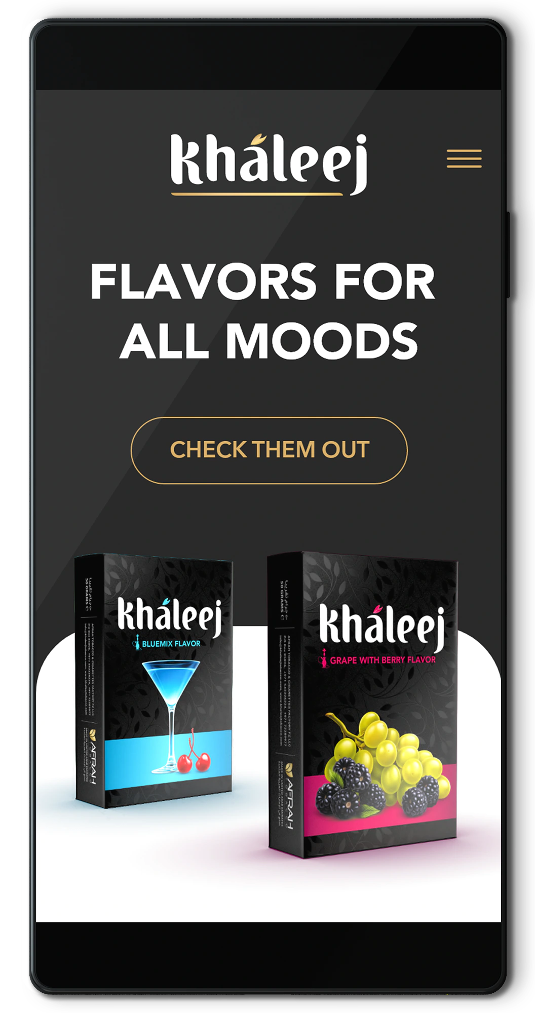
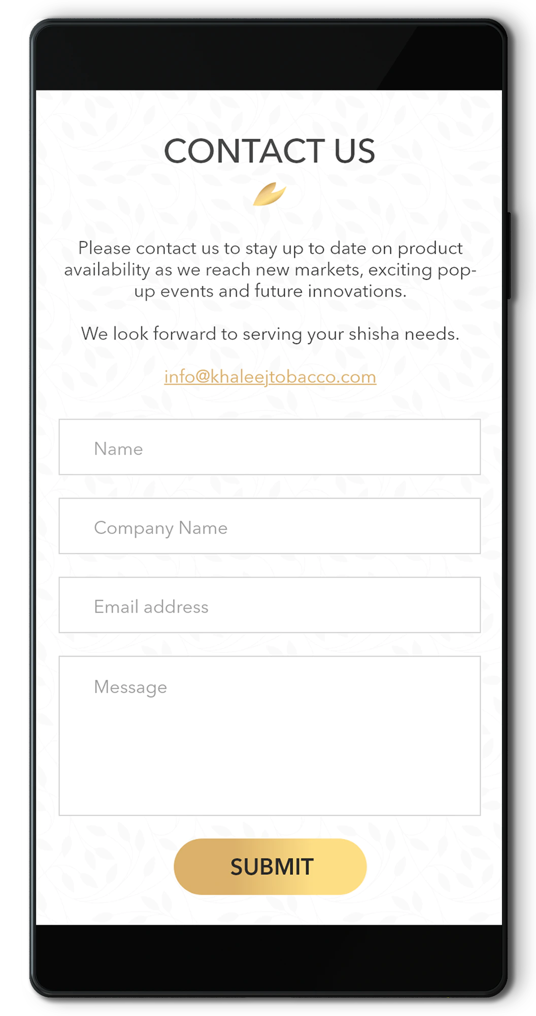
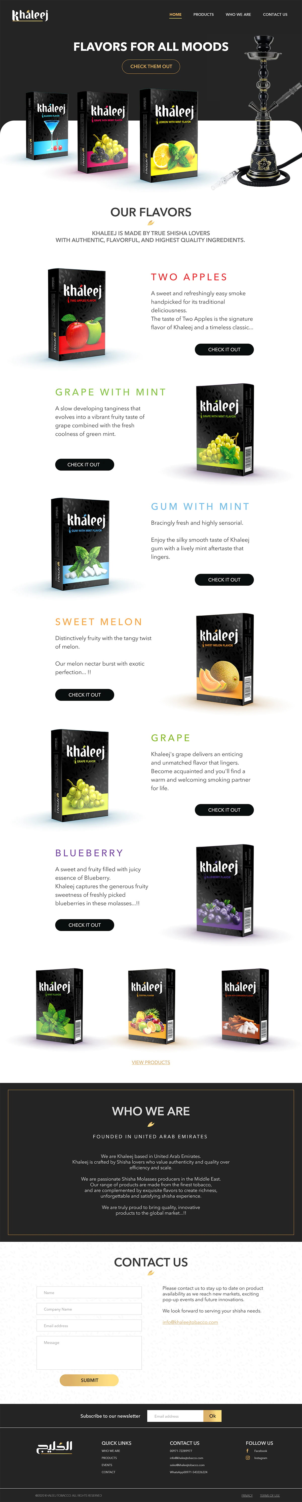
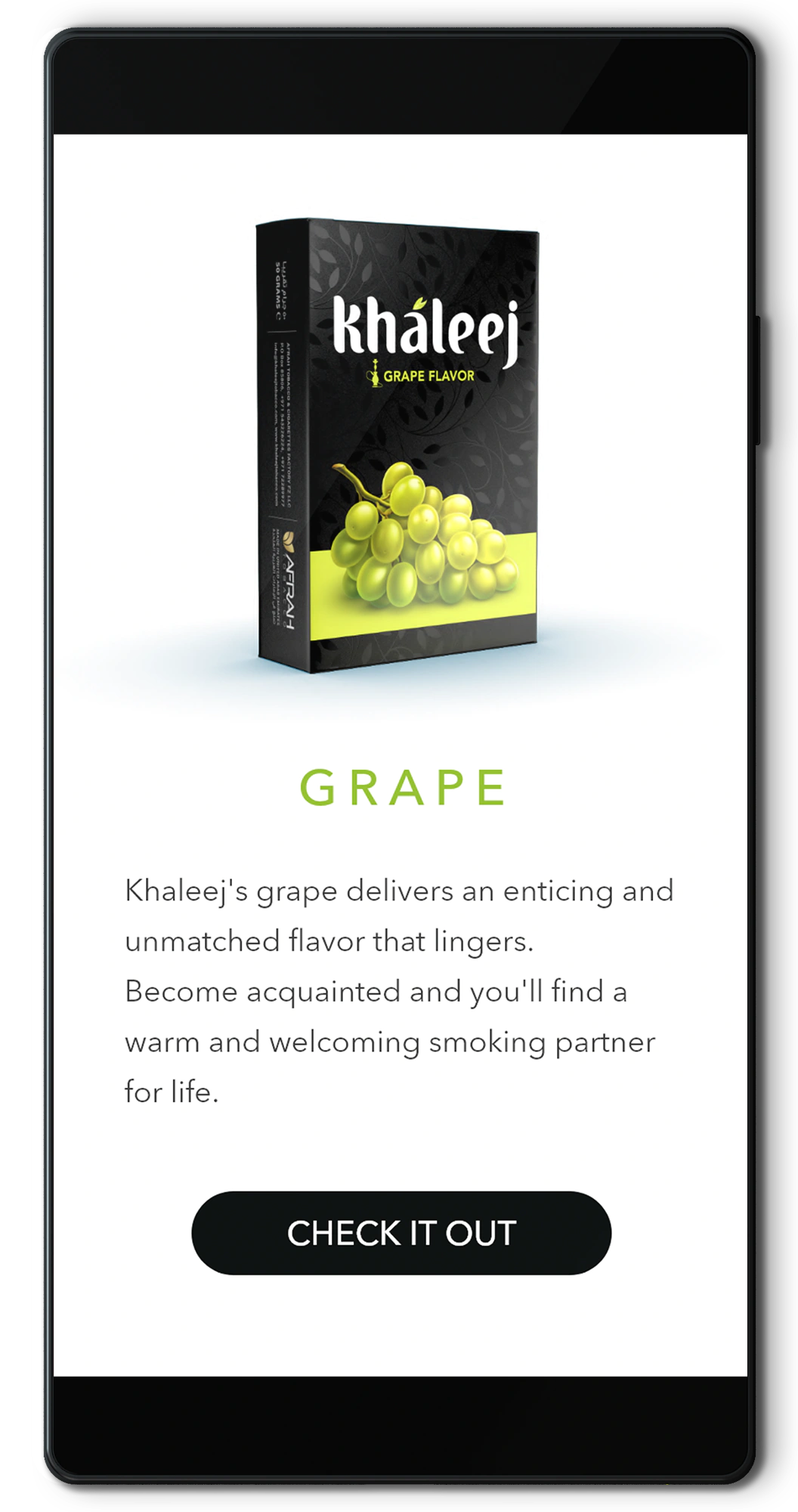
05 Home page
Powerful, impactful
Once I finished the wireframes and I was happy with the structure and the general usability, I started adding the branding elements and putting together a first concept.
We would narrow it down to 2 options, one with powerful accent sections, and another ruled by simplicity and minimalism. I cannot say how long it took to come to a decision about this.
Good thing, though, I decided to go modular, so the sections were easily exchangeable in case new products arrived, promotions were to be placed or simply they felt like rearranging.

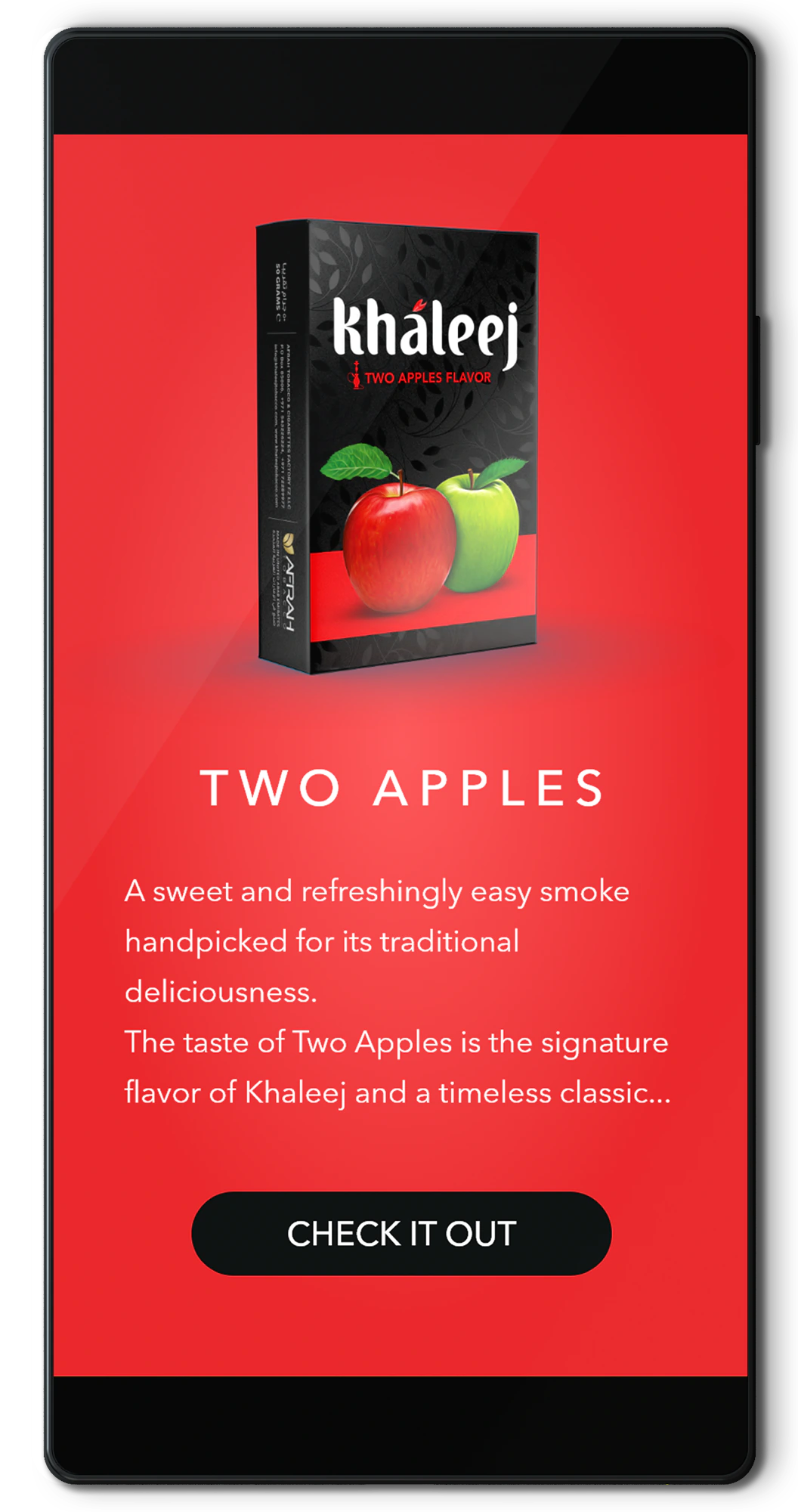
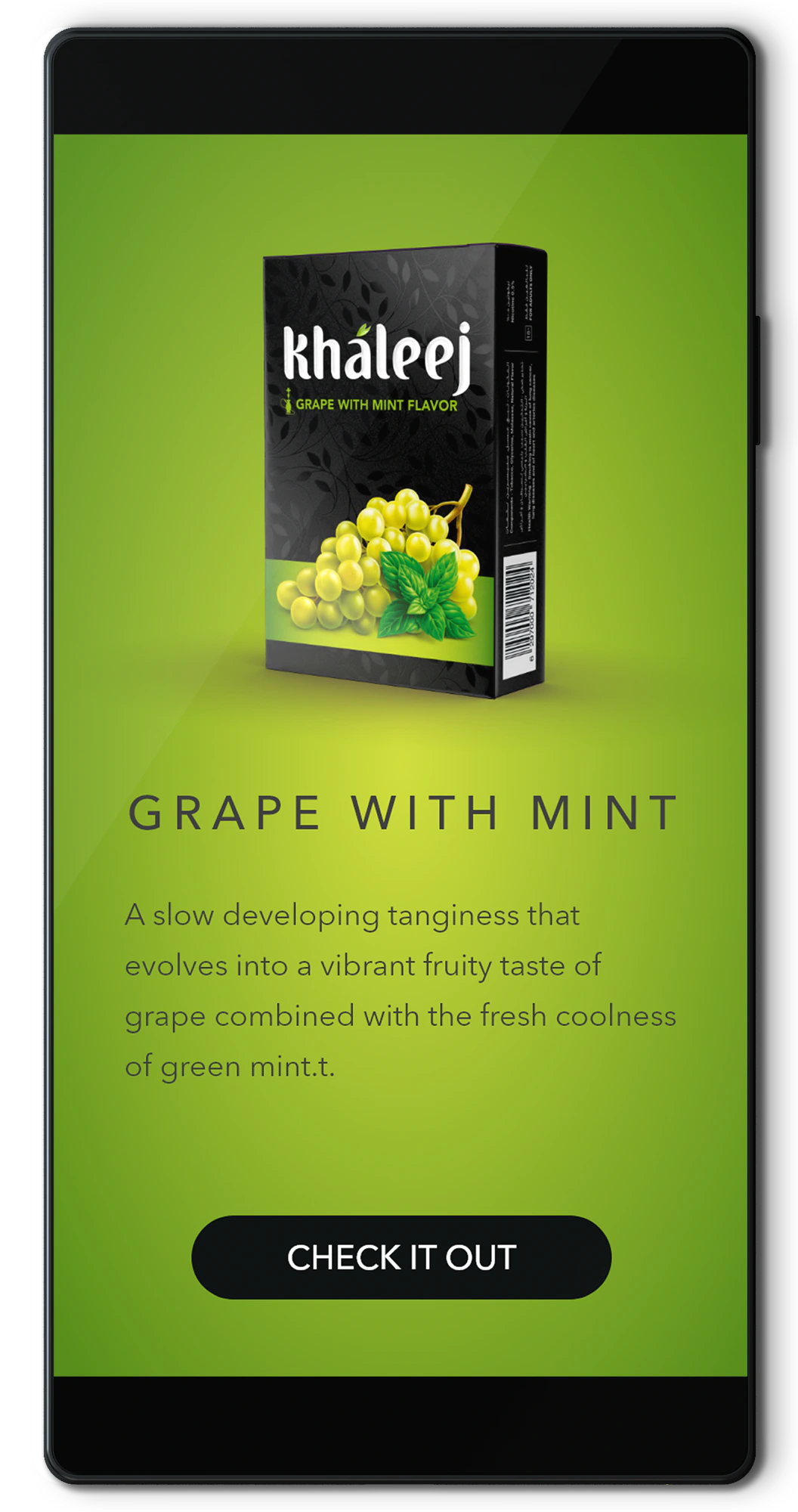
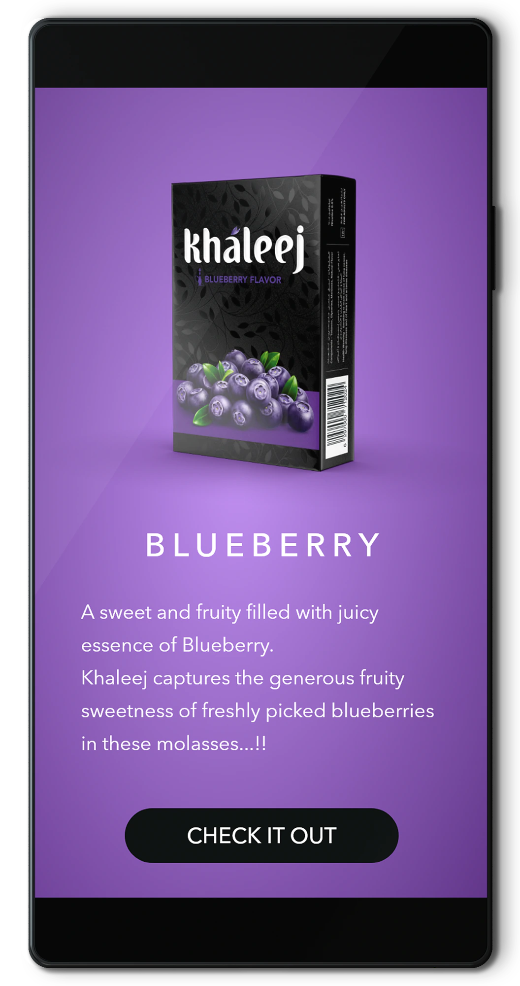
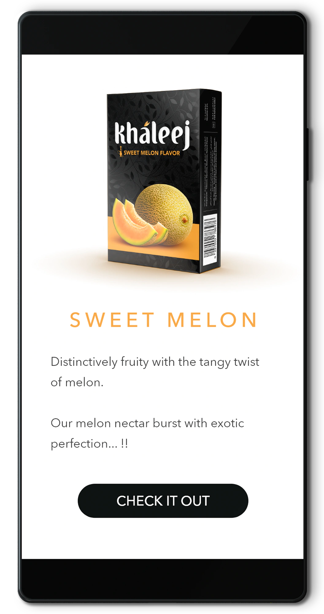
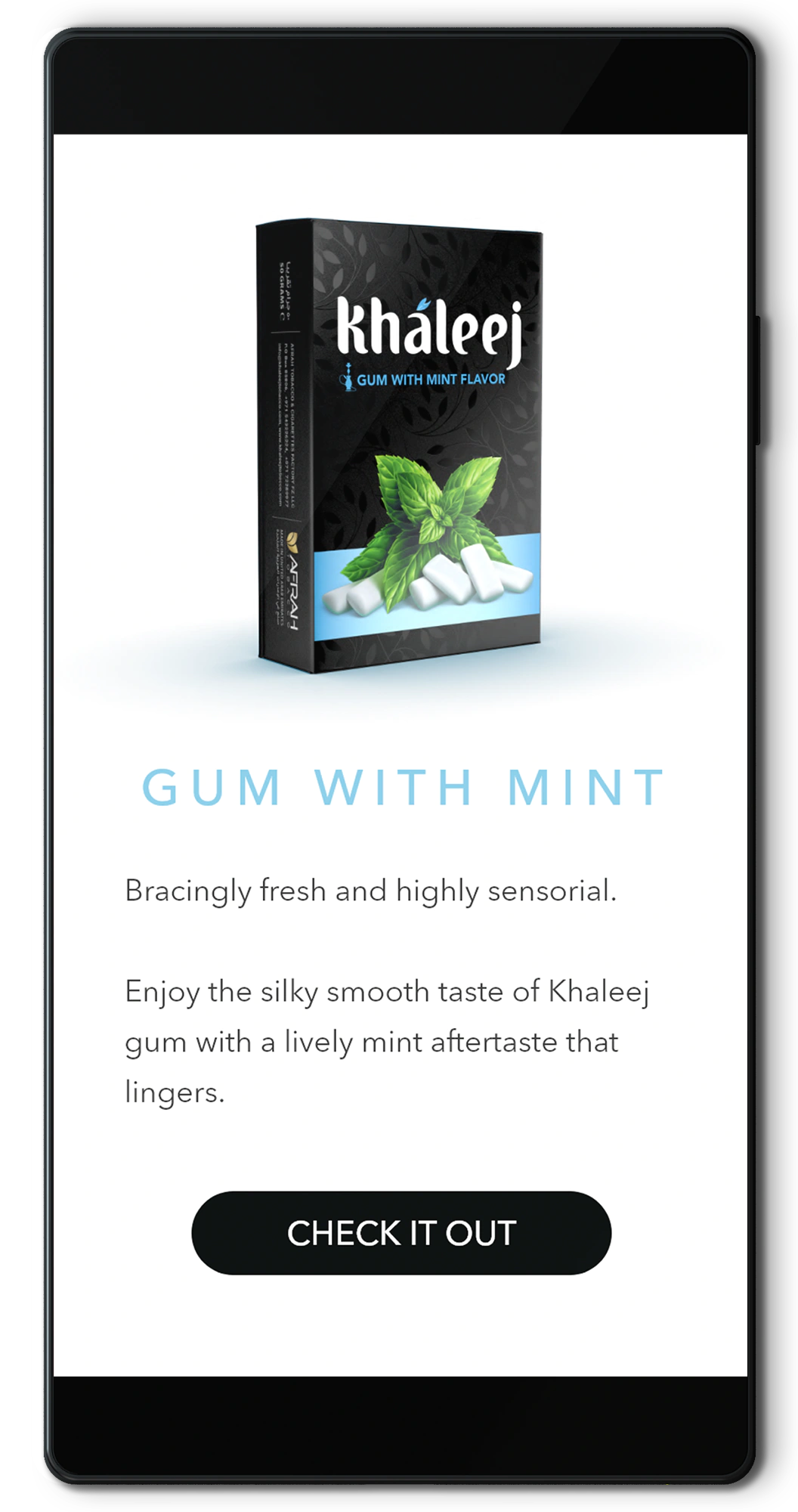
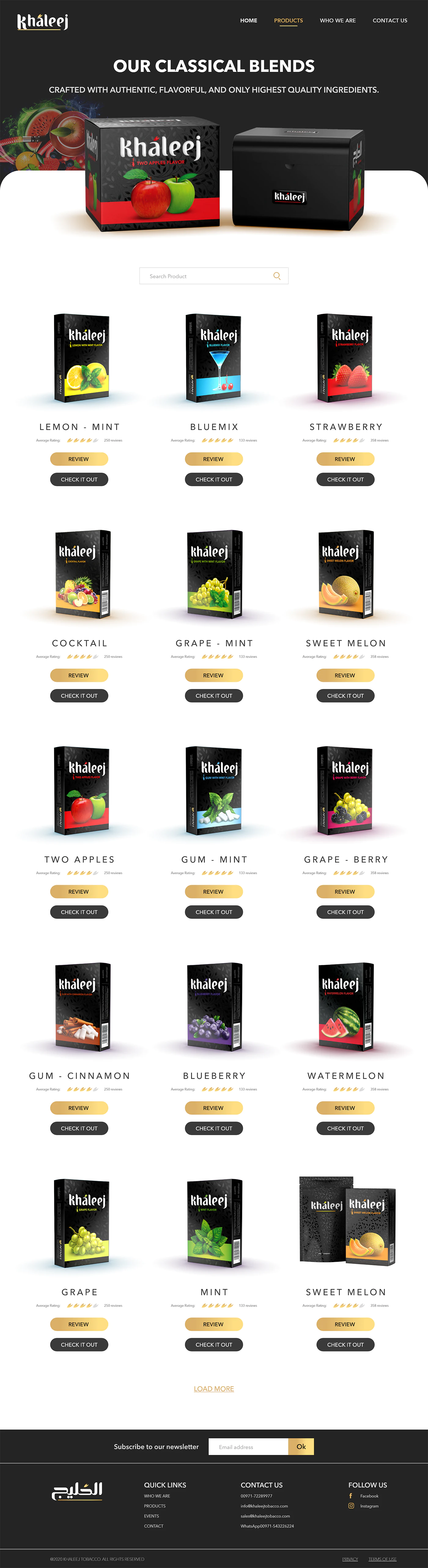
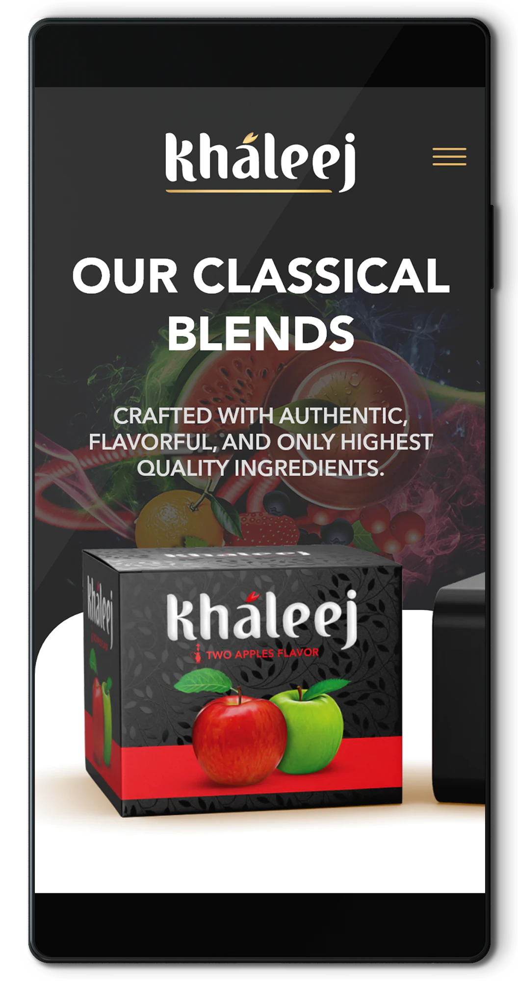
06 Products page
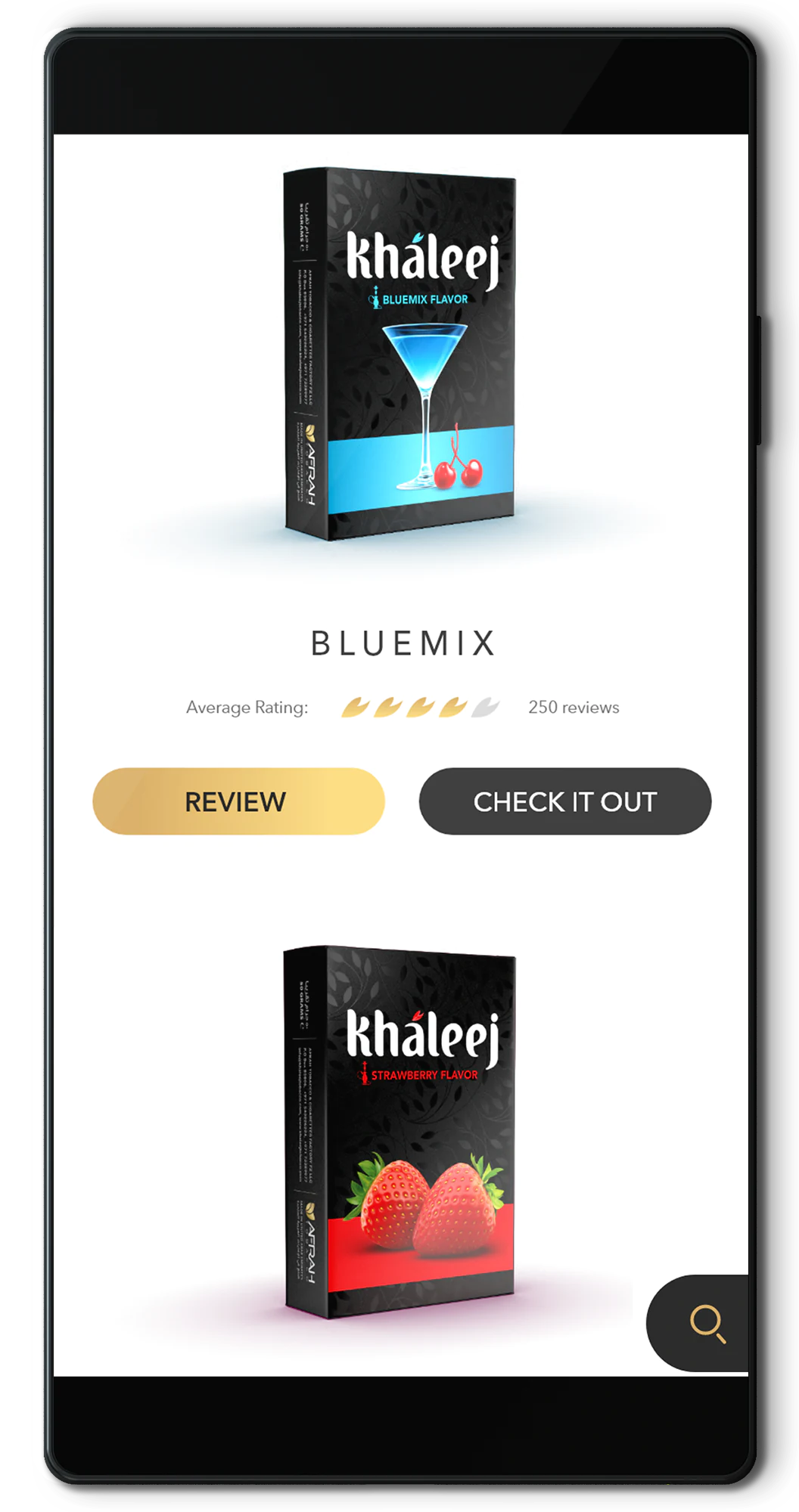
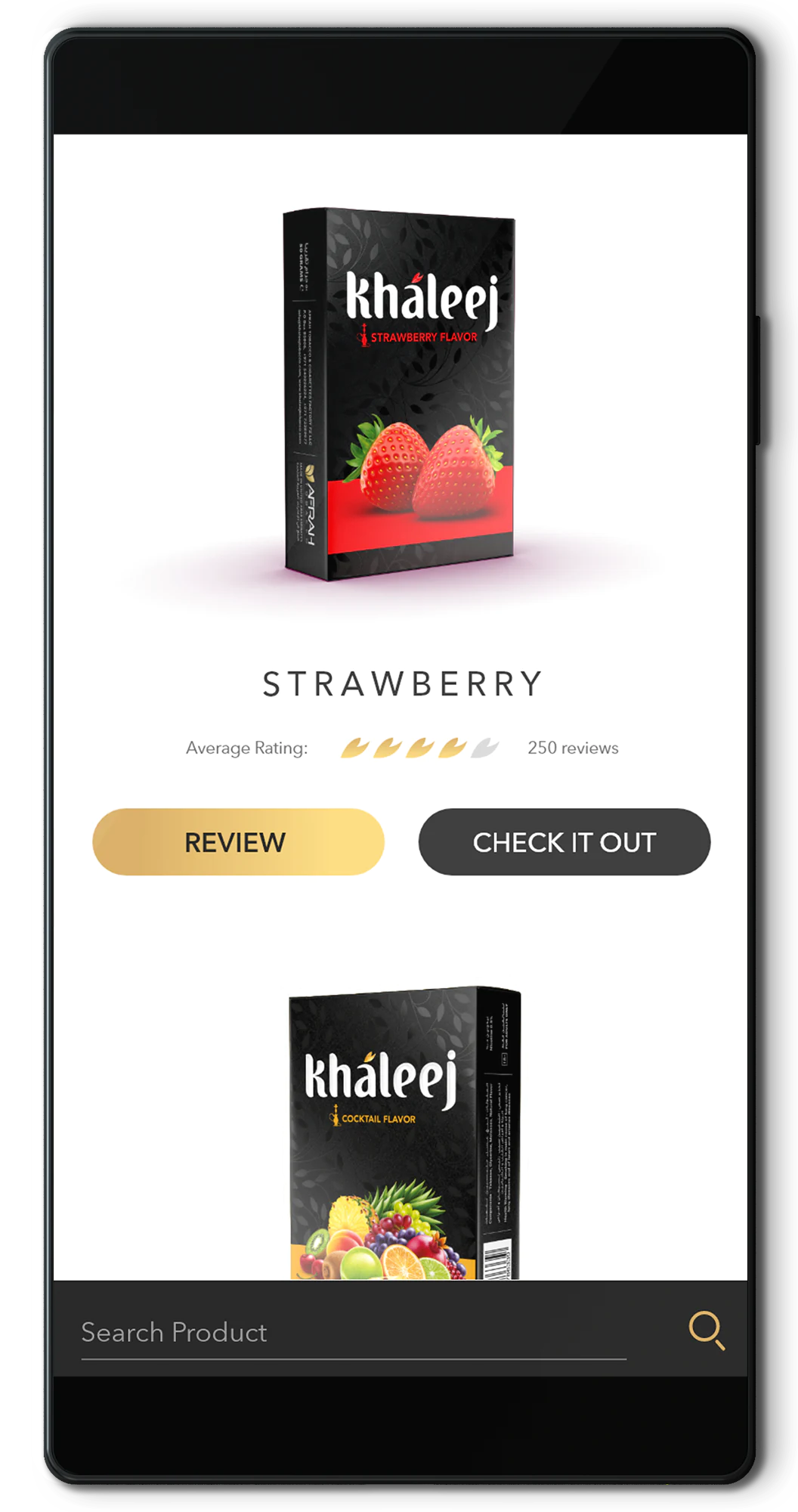
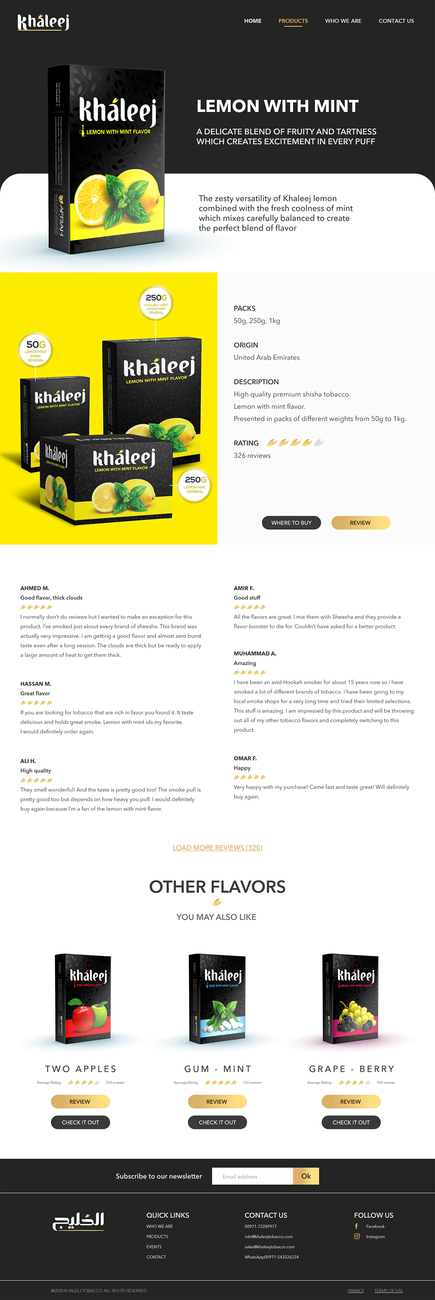
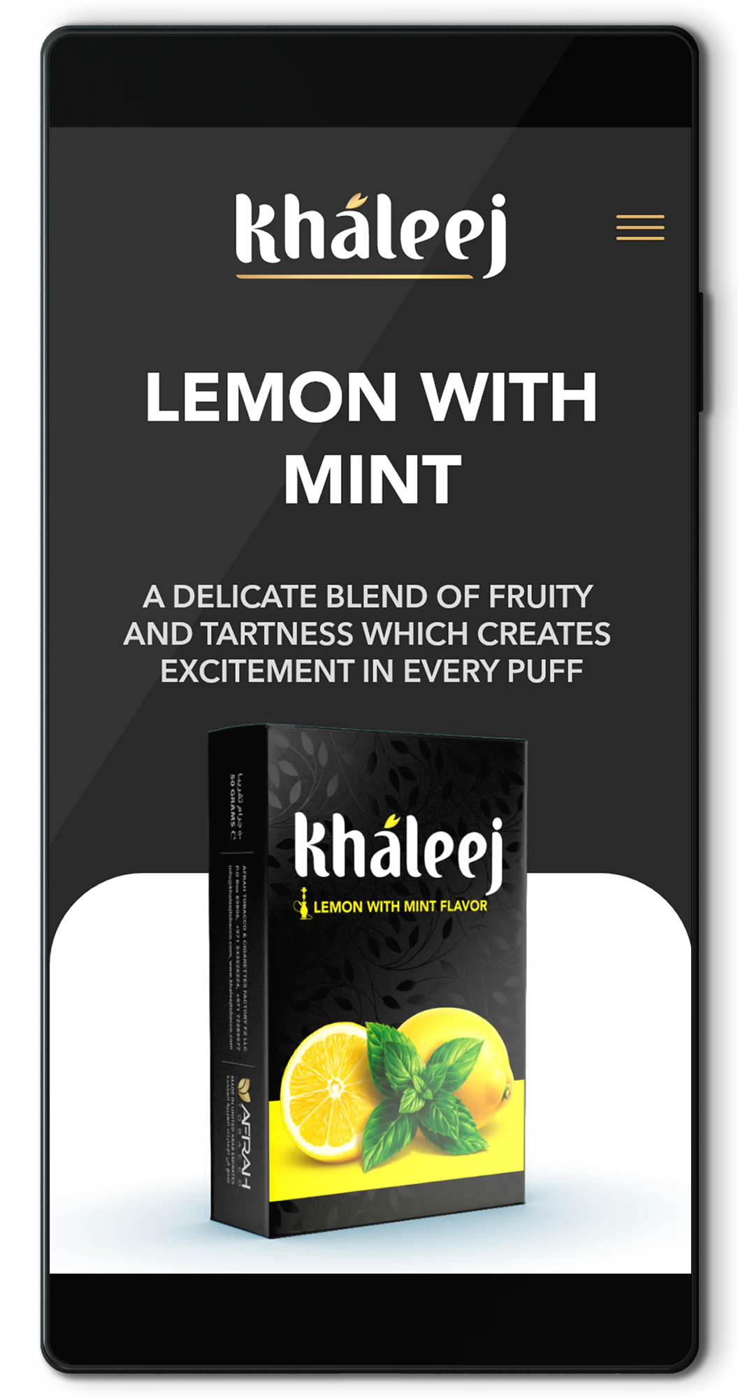
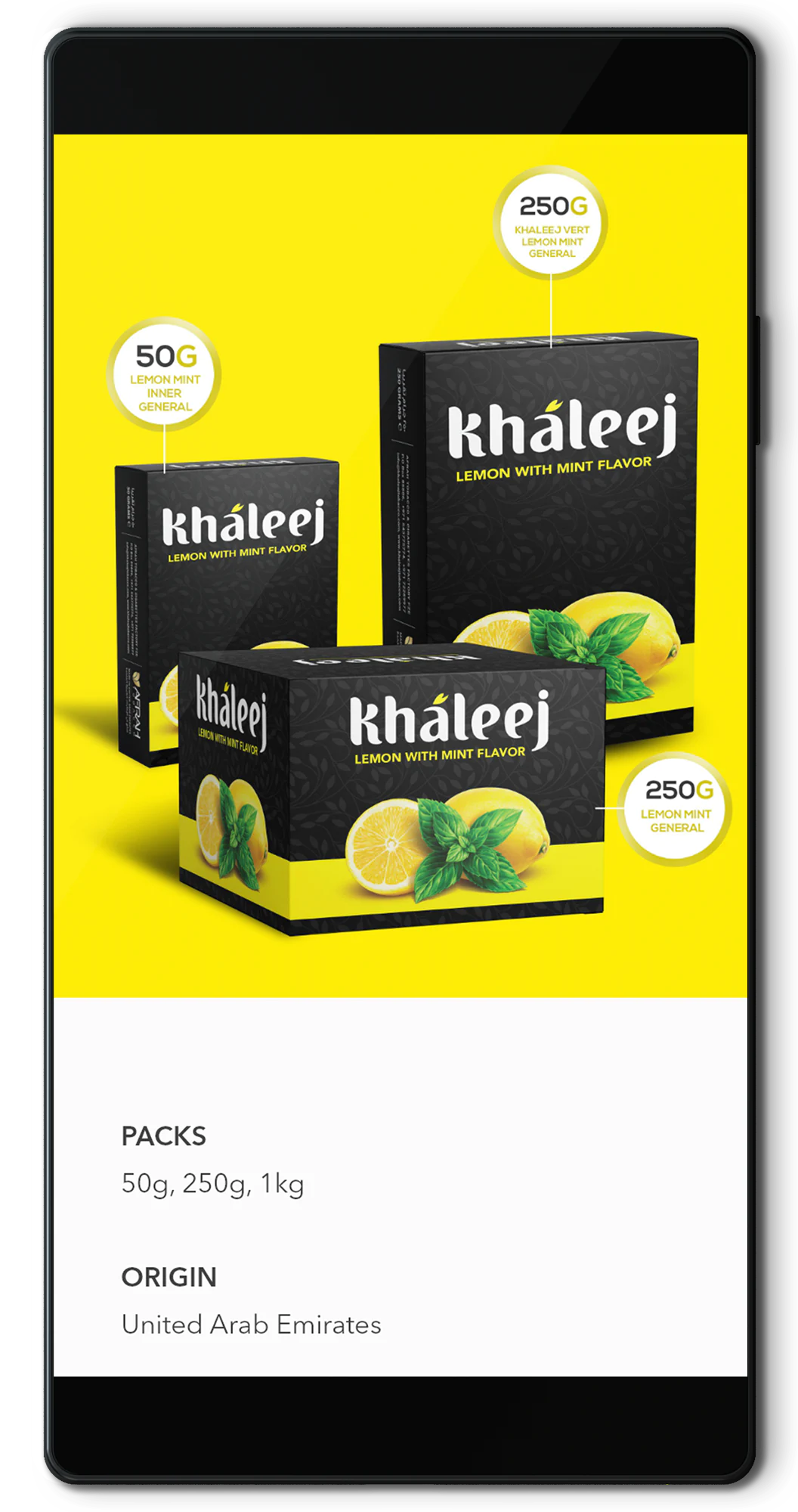
07 Product details
08 Conclusions and outcomes
The aftermath
We tested the final results and were widely welcomed by more than 80% of the audience. Even if the confusion about the reviews persisted, they seemed diligent to cut us some slack due to a fine UX and visual appeal of the most important elements of the site.
The design system grew from a design guideline to a digital set including a newly formed UI kit.