Thanks!
I hope you enjoyed the case study.
If you read it whole, you are EPIC.
If you like what I did for MiAffaire, contact me and we can talk about YOUR project.
DO IT NOW for extra awesomeness.
MiAffaire
2019 - 2020
Product Designer
App Design, Product Improvement, Product Growth
MiAffaire is a dating service for open-minded people
interested in sharing new experiences with others, with a
particular focus on excitement, discretion, safety, and
privacy. The first version launched in April 2014.
After many iterations and refinements over the years, I was
involved in the creation of the app version to improve the
overall experience and consolidate a design system.
To enhance the experience without having to use the web version on mobile, we needed to create an app that made the contact process faster and rethink the interaction of many features while keeping the elegant touch of the brand and the privacy.
The studio was receiving some complains about the chat being
too slow on mobile phones with weak bandwidth.
Customers were also missing fluid interactions, and those who
were used to apps were requesting them, despite the fact that
having such an app on the phone could jeopardize discretion
and safety, which were the product's flagships.
After some iterations, we improved many functionalities and
reduced the overall time needed to communicate and perform
core tasks, increasing user satisfaction. We also kept the
general style of the product for consistency.
According to the last testing results, about 82% of the users
feel more inclined to use the app.
More than 75% find the app remarkably easy to use.
A Copywriter, a project manager, a UX researcher, 3 developers.
Product design and UX. I also coordinated with developers to ensure optimal implementation.
UCD. Research , discovery, and analysis to diagnose problems.
Structured in phases guided by research findings and tests data.
MiAffaire app was a long due project. It had been on the table even shortly
after launch. The first big constraint was the viability of the MiAffaire project, for which we would
need a couple of years. The second was the nature of the project. Finding a way to keep privacy without
giving away the people using it was a big challenge.
Even if I had left the project and changed companies, I was called back to lead the design of the app. As
one of the players involved from the beginning, I had extensive knowledge of the product and its users.
Seems obvious. MiAffaire wanted more Premium users and the app was a perfect opportunity to address some of the issues that caused more bouncing.
Resolving the biggest frictions of the users on mobile could make Premium users to stay. Less frustration equals more engagement.
With the proliferation of apps and the coronation of Tinder as king of the mountain on dating, MiAffaire needed to stay strong to compete and satisfy its niche.
MiAffaire website has been online for many years already. When the app finally jumped to my task schedule, I had a pretty good idea of who was using the service and real data to support it.
At this point, we were mostly aware of their specific needs
and expectations for the website. After all, we had been
observing their behavior, listening to their problems,
changing and designing features to address pain points.
Now we needed to funnel and refine all this
knowledge into the app.
With all of this in mind, I created a set of assumed personas and hypotheses to test. It was also a question of getting to know and connect with people who were more likely to utilize an app vs those who were more web-oriented.
The concept of the brand had a radical turn from being an
almost selected secret club to becoming an open space where
people look for adventures and new experiences.
We needed
to know how this change was reflected in our personas.
With the aid of our copywriter, we created a survey, which we
launched internally so that everyone registered on MiAffaire
could participate. We used the chat to make users aware of the
situation (sending a message as Admin promoting a reward for
participation).
More than 200 people took the time to comment.
I was particularly interested in some specific personal perspectives, such as the main use, how long they felt they engaged with the service, the safety sense, difficulties they had, and other dating apps they used, among other things.
While the answers were coming in, we teamed up to collect statistics, analytics and other quantitative as well as more straightforward sources.
The customer support crew did an outstanding job of gathering
user suggestions, complaints, requests, and feedbacks from the
previous year prior to this research. This time frame was set
to guarantee that we could work with the most accurate and
up-to-date information possible.
We decided to conduct interviews as well as compile any
relevant information in a rough first affinity map in Miro.
My job here was to create the right questions, set up a
schedule for interviewing a few groups of people, then
evaluate everything and look for patterns that may provide us
with some insight.
This would drive the next steps.
Due to the nature of this product, an ethnographic field study
was out of the question. I decided we'd apply a more
behavioral process during testing.
We had a lot of data and analytics regarding mouse movement
and clicks for this round of study; it wasn't particularly
qualitative because it was unsupervised, but it had to suffice
for now.
I pinned 'more behavior' for later.
Before conducting interviews, I wanted to draw some clear conclusions from the vast amount of data we had.
I saw many problems whose roots needed finding. More importantly, how could we shape the app design to solve most of these issues?
We interviewed 14 individuals from those who answered the survey who better fit the requirements and represented the various presumed personas.
I supervised the interviews and double-checked the tapes for more detailed notes. An extremely talented and charismatic woman in the team conducted them in a semi-structured way as planned.
Several of these conversations were eye-opening.
Examples of real life situations that led to unexpected and
somehow wholesome discoveries. At some point, some of them
seemed relieved to show the more human side of having affairs
and not being judged.
Although time was not initially a major concern, we soon
realized that we had too much information to cover in the
allotted two months. It was an opportunity to examine
assumptions and begin validating and asking additional
questions.
In aras of defining problems, I draw a new richer assumptions
table taking into consideration:
Following the previous method, we refined the affinity map we opened in Miro a few weeks back. I like to pause sometimes to organize clusters of data with new insights, so this is not a daunting task later on.
With all the previous effort, I was able to create a new set of personas that were similar to the initial ones but different enough to allow me to convey to the team who were the individuals using the future app as opposed to the ones using the website.
35 - 45 years old
In a time-eroded relationship
They tried to fix it but didn't work
In some cases led to an open agreement
This persona's key traits are that their relationships are generally "healthy", that they are driven by the feeling of anticipation and risk while seducing or flirting, and that they prefer brief and informal encounters while maintaining their status.
Despite accounting for a small proportion of users, they have long requested that MiAffaire included a "couple gender" registration. They are motivated by the desire to do new things and explore certain fetishes together.
Following the research that allowed us to outline personas, we
took a look at everything we had so far.
I began outlining the insights and mapping them in the form of
concerns to be addressed:
It was a great catch to have a developed product as well as
such extensive and detailed user research. We could plan
smarter on how to deal with potential issues. And it made our
sprint sessions more efficient.
Many of the original product's features emerged
guerrilla-style over time, resulting in more problems, extra
work, and the need to rethink the entire structure.
Sometimes it's just how the product evolves.
I had a concept from the brand. However I had also the freedom
to modify the features so that mostly of the user problems
could be resolved.
We started by categorizing current features into groups based
on criteria such as whether they were core, if they met
consumers' demands, and whether they could be improved to
offer value and solve an issue.
I rated the most critical features of the app. My idea was to
locate the most important ones and give them a privileged
treatment in the app. Easier to see and access.
There would be some concessions to bring the profit model to
the table.
My task was to do it in a way that did not degrade the user's
experience while also not harming the company's revenue model.
Customer journey maps that are comparable to those on the website but customized for the app. It helped us in quickly seeing the user's behavior and identifying the user's pain and frustration points.
No ideation job is right until I get my hands dirty with my pens. Sketches are a great way to preview concepts and try different possibilities. Sometimes the best solution comes when visualizing from far, and letting the dirty paper out to the audience.
We brought the user back to our table to get some feedback and possible alternative road. We asked them to perform some tasks on a low fidelity prototype I prepared and noted down the results.
This session produced exciting findings, prompting another round of sprints to improve concepts and come closer to a fully functional low-fi version of the future app. In concrete:
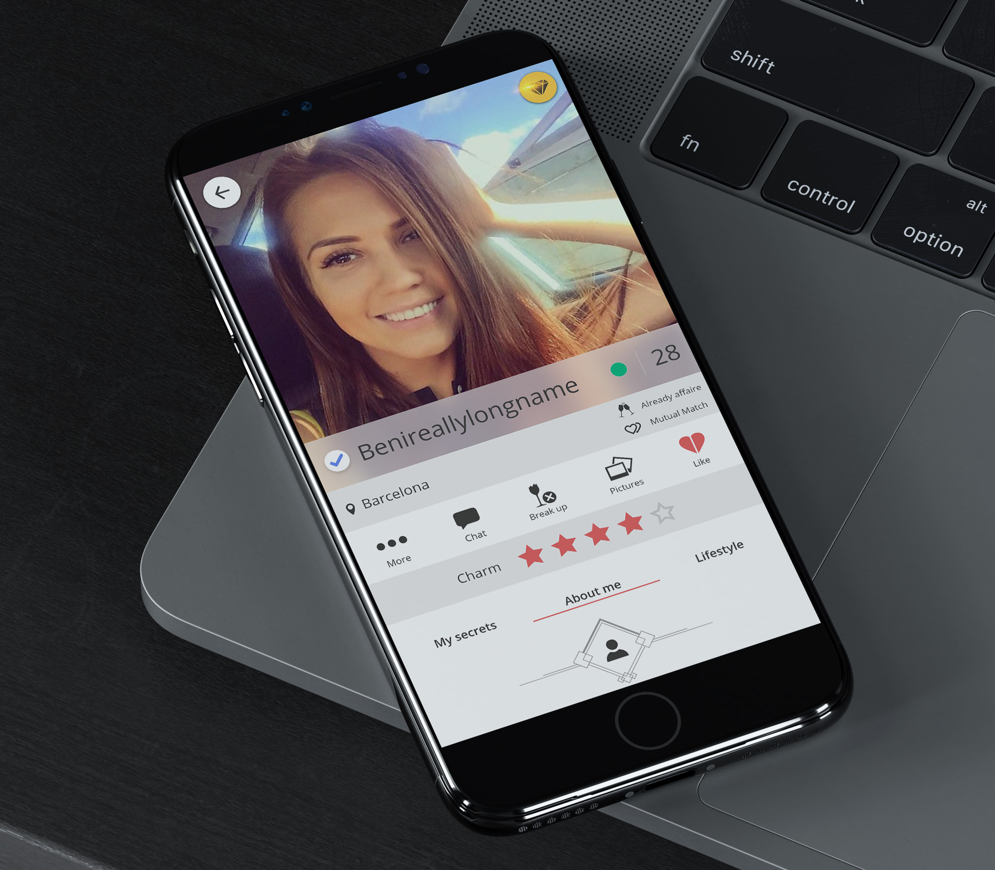
I restructured the main flow so it took just 3 steps to start chatting. In the best-case scenario, search results (1) would be the default initial interaction, followed by seeing a relevant profile (2) and sending a message (3).
I agreed with the developers that we required a stronger infrastructure to make the chat flow smoothly and quickly. It was built on an obsolete technology that sent queries to the server every 2 seconds, rather than being real-time responsive to changes.
Notifications would not be considered, just opt-in emails. Even if they are an effective method of increasing engagement, the cost in terms of safety was much too high.
Curiously, throughout the interviews, we discovered the most
common methods users hide apps and data from others. They
primarily lock their phones and refuse to let their partners
to check them. Then there are those that constantly install
and delete compromising apps.
Phones also offer ways to hide apps. Deactivating
notifications and using the app when being alone were also
mentioned.
We brainstormed through ways to implement a gate to disguise
the app. The most celebrated was the creation of a login page
that displayed an affair (list of things) organizer. As well
as not using the mask icon for the app store.
We needed to be careful not to violate the deception rules of
the app stores, though.
I had a talk with the devs about including the "couple
gender". Technically was out of the frame at that moment.
As skeptic as I was, we pinned this for a future update
because a lot of things would need to be changed.
Experiences finder was more related to couples than I would
have liked. They were basically using it to try to contact
people to experiment some fantasy or fetish, or simply to try
to hang out with other couples.
This feature would get a reboot in an attempt to soft the
couple problem and solve the experiencing new things gate
problem.
Many other small issues came to the board during this phase.
Many of them had simple solutions that would be fixed simply
building the app. Others, though, caught me off-guard and took
too big of a chunk of the time we had.
Some examples of this are listed below:
Thanks!
I hope you enjoyed the case study.
If you read it whole, you are EPIC.
If you like what I did for MiAffaire, contact me and we can talk about YOUR project.
DO IT NOW for extra awesomeness.